
Branding guide
MIAMORII – Visual Identity Quick Guide
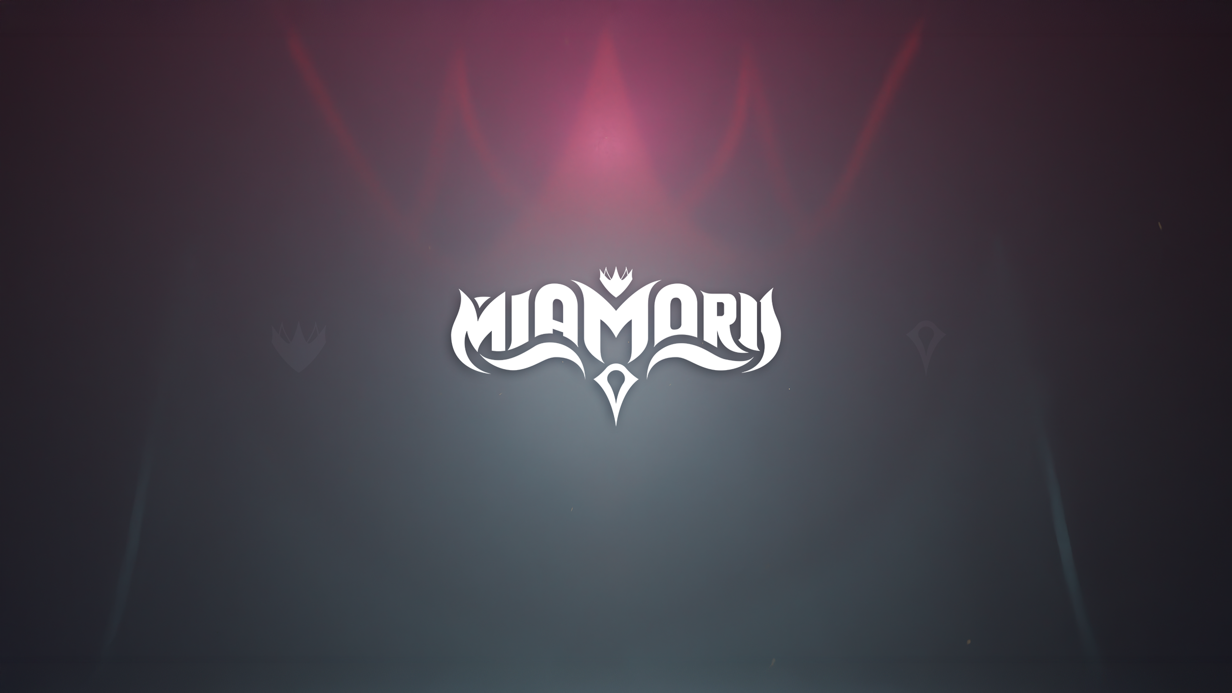
Logo Usage
Do not edit or distort the main logo shape.
Recoloring is allowed, as long as the form stays intact.
You may apply tasteful effects (texture, glow, drop shadow, metallic finish, etc.) to fit the aesthetic.
Maintain a clear space around the logo; do not crowd it with text or visuals.
Do not stretch or skew the logo’s proportions.
Avoid low contrast placements. The logo should always remain visible and legible.
You are not required to use any “Core Colors”, feel free to use colors that fit the theme.
Main Font
Palatino Linotype
Core colors
Band Red: #BA2F35
Reena Red: #782026
Kyle Purple: #6e46b8
Cam Blue: #0271FE
Nate Gold: #A47D45
Download Assets
Logos, photos, banners etc